Personal Notes on the ATypI Hong Kong 2012 and the Type Renoir in Hong Kong
It is an epoch-making event that the first ATypI Conference in Asia was held in Hong Kong this year. Many participants from countries using non-Latin scripts came to Hong Kong. The professors, lecturers and students of the School of Design, the Hong Kong Polytechnic University supported the ATypI Hong Kong 2012, and without their support and hard work, the first ATypI conference in Asia could not have been realized.
In the following paragraphs, I would like to mention some points about the ATypI Hong Kong, as well as the Type Renoir in Hong Kong. The latter is a seminar usually held in Tokyo by a group of Japanese typeface designers.
On October 11, I met Mr. Henry Steiner, one of the keynote speakers at the ATypI Hong Kong 2012. More than 22 years had passed since I met him last time in Tokyo, when he came to Japan to participate in the judging for the Morisawa Awards International Typeface Design Competition. I was very glad to learn that he was very well and still very active in the graphic design scene, as one of the most respected graphic designers in Hong Kong.
Another keynote speaker, Mr. Katsumi Asaba brought his old panorama camera (WIDELUX?), as he did it at the TYPOJANCHI 2011 Seoul conference in Korea last year. His speech including his own handwriting performance covered a wide range of East Asian characters in history. I remember his graphic design works for an exhibition of Paul Klee’s works. The works showed his very sharp sense and judgment in composing objects and spaces.
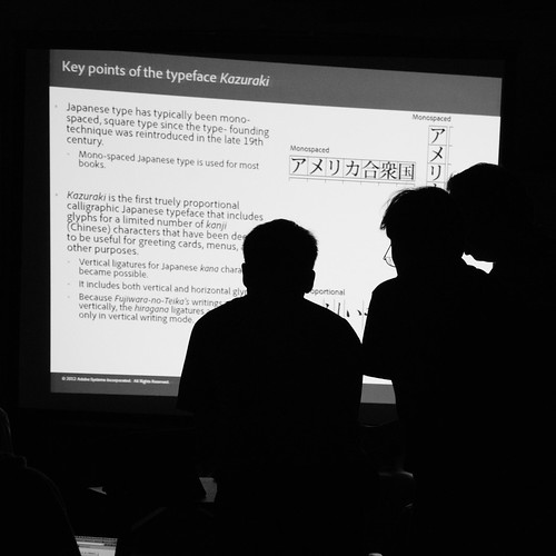
As Adobe's Japanese type design team members, Ryoko Nishizuka and I made a presentation about the typeface design Kazuraki® released by Adobe® Systems. It was the first true proportional Japanese typeface. The design was based on the handwriting of Fujiwara-no-Teika, one of the most famous writers and calligraphers in the twelfth century. Christopher Slye and Bryan Mason's presentation scrutinized the existing forms of font licensing and discussed how it should be. Ken Lunde and Masataka Hattori taught how to use Adobe Font Development Kit for OpenType® (AFDKO) at one of the workshopsps.
On October 13, the Shinsekai Type Study Group, composed of the Japanese type designers: Mr. Tetsuya Tsukada, Mr. Hidechika, Mr. Yoshihide Okazawa, made an interesting presentation about their new typeface. It is based on the “revolutionary” idea that the letter form structures of Japanese kana syllabic characters should be radically transformed into a set of shapes that are perfectly suitable for the horizontal writing mode. Their joyful presentation received a round of applause. Their “ideas” are always persuasive, because their ideas are based on deep thought. The word “Shinsekai” used for their group name means “the New World”.
At the gala party on October 13, I met Prof. Min Wang, of the Central Academy of Fine Art, Beijing. He is one of the keynote speakers. More than ten years had passed, since I needed to talk with him on the phone, when he was involved in the process of making a type specimen book for the typeface family of Kozuka Mincho®. But, I remember I met him in person at a party Ms. Kei Befu held at her house in the Stanford University, twenty years ago.
Also, I saw Mr. Joachim Müller-Lancé, whom I met last time at the exhibition of Helmut Schmid’s works: Helmut Schmid:15 Politypographien held at the Print Gallery, Tokyo in this July. The width and depth of the freedom of thought found in many of his typefaces are comparable to those of the Shinsekai Type Study Group. Whenever I look at his typeface Ouch!, I cannot help being in tears.
When I saw Mr. Jürgen Willrodt of URW++, I learned that Dr. Uwe Führmann passed away years ago. When I met him at the ATypI conference in Boston in 1997, he looked very well. I remember many people in the digital type industry remember him and his contributions to the foundation of today’s digital font technology.
I had met Mr. Qin Du in Tokyo, before I came to Hong Kong. He is one of the researchers from the Central Academy of Fine Art (CAFA) in Beijing, where Prof. Min Wang is teaching. His study tries to comprehensively grasp the history of Chinese typography and the transition of Chinese printing type, especially its modern development, as a vast set of inter-related factors such as printing technologies and the reformation movements in Chinese orthography, etc. Mr. Hua Jiang of CAFA also tries to clarify the relationships between the Chinese typographic design in the 20th century and the modernist movements in the Western world by investigating various examples. It is clear that their research activities will help us understand Chinese typography and its modern history more deeply, from different viewpoints. It is expected that they will succeed in further developing and refining their studies.
Mr. Akira Kobayashi’s answer to the question: why the round gothic (Maru Gothic) style is popular and widely used for signboards in Japan was very reasonable and clear. He concluded that Japanese sign painters knew that drawing characters in the round gothic style required fewer steps to finish drawing each stroke terminal than in drawing a standard Gothic (sans-serif) stroke. More than ten years had passed since I met Mr. Kobayashi previously. The ATypI Hong Kong 2012 made it possible for me to have reunions with many old friends and colleagues in the typographic community.
The last keynote speaker was Mr. Sammy Or. In Japan, one of his typeface designs, shòujīntǐ(瘦金体, so-kin-tai in Japanese)is widely known. It was named after the calligraphic style with the same name, first used by the Emperor, Huī Zōng(徽宗)who was active in the early 12th century. The sharp, strict handwriting forms a good contrast with his paintings, painted with the méigǔ or mògū method (没骨, mokkotsu in Japanese), which look very soft, smooth, gentle and elegant. In the East Asia, the time and space that Chinese letter forms and typography have pervaded are extraordinarily vast. The world of Oriental writing and typography seems unlimited and infinite.
At the annual meeting, Mr. Keith Tam was appointed to the Country Delegate for Hong Kong. I would like to congratulate him on the new role in ATypI. It is very clear that the ATypI Hong Kong 2012 could not have been realized without his energetic effort, and everyone appreciates his contribution.
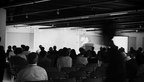
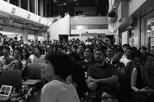
On October 14, after all the ATypI sessions were over, the Type Renoir in Hong Kong was held at the School of Design, the Hong Kong Polytechnic University. The Type Renoir is usually held in Tokyo by a group of Japanese typeface designers. But this time, it was held in Hong Kong, and some of the speakers at the ATypI conference were also invited and they made presentations, but the presentations were made a bit more informally than at the ATypI sessions. I was surprised at the large size of the audience. More than 300 students enjoyed themselves listening to the presentations. I saw many young people were interested in typography in Hong Kong, and they are seriously studying typography.
No doubt, the ATypI Hong Kong 2012 and the Type Renoir in Hong Kong could not have been so successful without the great effort and hard work made by the organizing team, mainly composed of professors and students of the School of Design, the Hong Kong Polytechnic University. In addition, as far as the ATypI Hong Kong 2012 is concerned, it became possible with all the effort by the ATypI’s Board of Directors and members, and the financial support by the sponsors was essential. As a member of ATypI, I would like to express my deepest appreciation for their great achievement in Hong Kong. Thank you very much.
Taro Yamamoto
(Country Delegate, Japan)
ATypI Hong Kong 2012とType Renoir in Hong Kongについての個人的な感想
まず、ATypIの総会がはじめてアジアで開催されたことは喜ばしい。それによって、中国語圏のさまざまな国や地方からの参加者、日本を含む非ラテン文字使用国家からの参加が増えた。これを支えたのは、The Hong Kong Polytechnic UniversityのThe School of Designの教授陣と学生の支援によるところが多いと思う。彼らのおかげで、素晴らしい総会をアジアで開催することができた。
ここでは、いくつか個人的に興味深かった点について述べることにする。
10月11日、キーノートスピーカーの一人、Henry Steiner氏とおよそ22年ぶりにお目にかかった。前回は、モリサワのタイプフェイス・コンテストの審査員として来日されていた。お元気そうで、現在でも香港を代表するグラフィック・デザイナーとして活躍されているご様子。
日本からのキーノートスピーカー、浅葉克己氏は昨年のTYPOJANCHI 2011 Seoulの際と同じく、パノラマカメラ(WIDELUX?)を持参され、書の実演を交えたスピーチは、幅広い東アジアの文字の歴史をたどるもの。TYPOJANCHIではPaul Klee関連のグラフィック・デザインが展示されていて、緻密で入念な構成に鋭い感覚が表れていたのを思い出す。
アドビの日本語タイポグラフィチームのメンバーとして、西塚涼子と私は、かづらき®書体に関するプレゼンテーションを行った。かづらきは、本来の意味でのプロポーショナルフォントを日本語用に実現したもの。他のアドビのメンバーでは、Christopher SlyeとBryan Masonが既存のフォント・ライセンスの在り方を精査して、未来のフォント・ライセンスの在り方を探った。Ken Lundeと服部正貴とはワークショップで、AFDKO (Adobe Font Development Kit for OpenType) を使用してOpenType®フォントを作成する方法を説明した。
10月13日には、新世界タイポ研究会(塚田氏、秀親氏、岡澤氏によるグループ)が、横組みに適合した仮名文字デザインのプレゼンテーションを行った。仮名文字自体の構造を横組み用に変えるという、かなり革命的なアイデアに基づいている。プレゼンテーションは楽しく、拍手喝采を浴びていた。彼らの大胆な試みには、いつも深い思考が基盤にあるので、説得力がある。
10月13日の晩餐会では、もう一人のキーノートスピーカー、Min Wan氏と再会。小塚明朝のパンフレット作成の件でAdobeのグラフィックデザイナーをしていた彼と電話で話して以来のことで、10年以上前のことだった。直接会ったのは、別府けい氏がスタンフォードの自宅で開かれたパーティで会って以来。20年近く前のことだ。
その晩餐会では、多くの人にお会いした。Joachim Müller-Lancéは今年、Helmut Schmidの7月の展覧会(プリントギャラリー)で会って以来。書体デザインにおけるアイデアの天衣無縫さにおいては、彼も新世界タイポ研究会に負けてはいない。Ouch!など、一目見ただけで涙が出そうになる。
URW++のJürgen Willrodt氏から、かつてURW社におられたUwe Führmann氏が亡くなられたということを知った。ボストンのATypI総会(1997年)で会った時はお元気だったのだが。デジタルタイポグラフィの発展過程において重要な成果を同氏が残されたことは、多くの人々の記憶に残っているに違いない。
Min Wang氏が教えている、北京の中央美術学院からは多くの研究者が今回のATypIに参加していた。Qin Du氏とは香港に来る1ヶ月ほど前に東京で会ったばかり。ATypIでも、歴史的な視点から中国における活字書体とタイポグラフィとを論じていた。同様に中央美術学院のHua Jiang氏も、モダニズムとタイポグラフィとが中国においてどのように連関して展開してきたかを多くの実例を示しながら論じていた。彼らの理論的研究は、漢字圏におけるタイポグラフィの将来に大きな貢献となることが期待される。より緻密で精密な研究成果に期待したい。
10月13日の小林章氏の丸ゴシック体が日本で多用される理由を説明したプレゼンテーションの内容は、レタリングで効率的なスタイルとして丸ゴシック体が広く使われてきた、というもの。至極もっともな話だと思う。彼とも10年ぶりに再会した。会っていなかった人達に会う機会が今回のATypIといえようか。
さて、キーノートスピーカーといえば、閉会の際の講演はSammy Or氏によるものだった。書体デザインの中には、痩金体の漢字が日本では良く知られている。痩金体といえば、徽宗皇帝の書が有名。鋭利で厳しい徽宗の痩金体は、没骨技法による温和な印象の彼の絵画作品と好対照をなしている。東アジアにおいて、文字とタイポグラフィが関わる時間と空間の広がりは広大だと感じた。東洋の文字は無限だ。
ATypIの年次総会では、Keith Tam氏が香港のCountry Delegateに選ばれた。Country Delegateの一人として祝福したい。Keith Tam氏の尽力によって、アジアで最初のATypI総会の開催が可能になったことは明らかで、その貢献には誰もが感謝している。
10月14日、ATypI閉会後、Type Renoir in Hong Kongが、The School of Design, The Hong Kong Polytechnic Universityで開催された。日本の書体デザイナーやフォントメーカーを中心に、ATypIでの講演者も招いて、少し違った視点からプレゼンテーションを行った。プレゼンテーションの内容は各人の作品紹介や制作工程の説明など、ATypIにおける内容よりも、気楽で楽しい内容のものが多かった。300人ほどの聴衆の多くは学生で、その人数の多さ、タイポグラフィの関心の高さに驚いた。香港では、若い世代のタイポグラファやデザイナーが多く育っていることが分かった。
ATypI Hong Kong 2012及びType Renoir in Hong Kongのどちらも、The School of Design, The Hong Kong Polytechnic Universityの先生方や学生達の尽力によってはじめて実現した。ATypIについては、さらに理事会と会員の努力、そしてスポンサーからの経済的支援がなければ実現できなかった。ATypIの一員として、深く感謝します。ありがとうございました。
山本太郎
(Country Delegate, Japan)
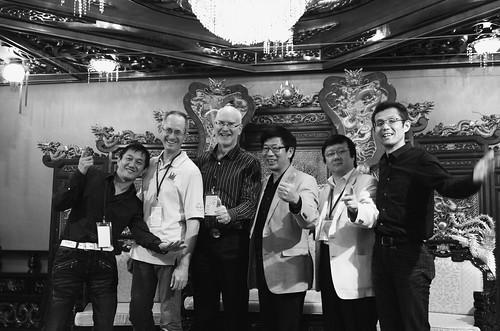
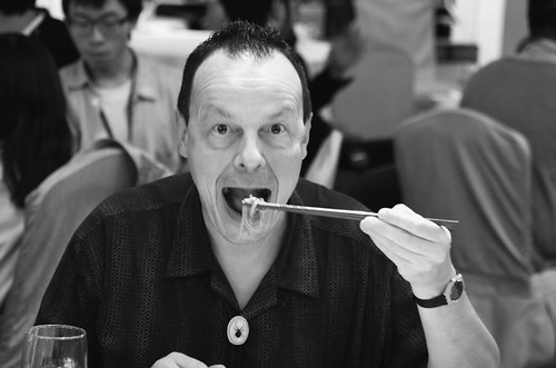
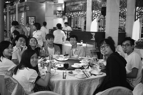
Reunion of some Adobe and ex-Adobe members at the gala party, the Jumbo restaurant, Aberdean, October 13, 2012.