As shown in the example in Figure 1 above, Latin glyphs designed and intended to be used with a Japanese typeface, intended to obtain a better visual balance between the Latin alphabet and Japanese fonts, tend to have their descenders compressed and distorted in the vertical direction. I would like to discuss this kind of Latin alphabet glyph designs frequently made in the Japanese “Phototypesetters Era”.
A font was called a “Mojiban” or 文字盤 when Japanese manual phototypesetting machines were widely used (until the end of the 1980s). One font (or two) was attached to a phototypesetting machine, located between a light source and a switchable lens system. Light beams from the light source are filtered by the glass-grid font with a photographic film sandwiched by two glass-plates, or a photographic glass-plate containing negative images of characters, and proceed through the lens system, so that the light beams can reach the surface of a sheet of photosensitive paper or film to form character images onto it. Such a phototypesetting machine included mechanisms with which characters could be precisely arranged and reproduced on the photosensitive paper or film.
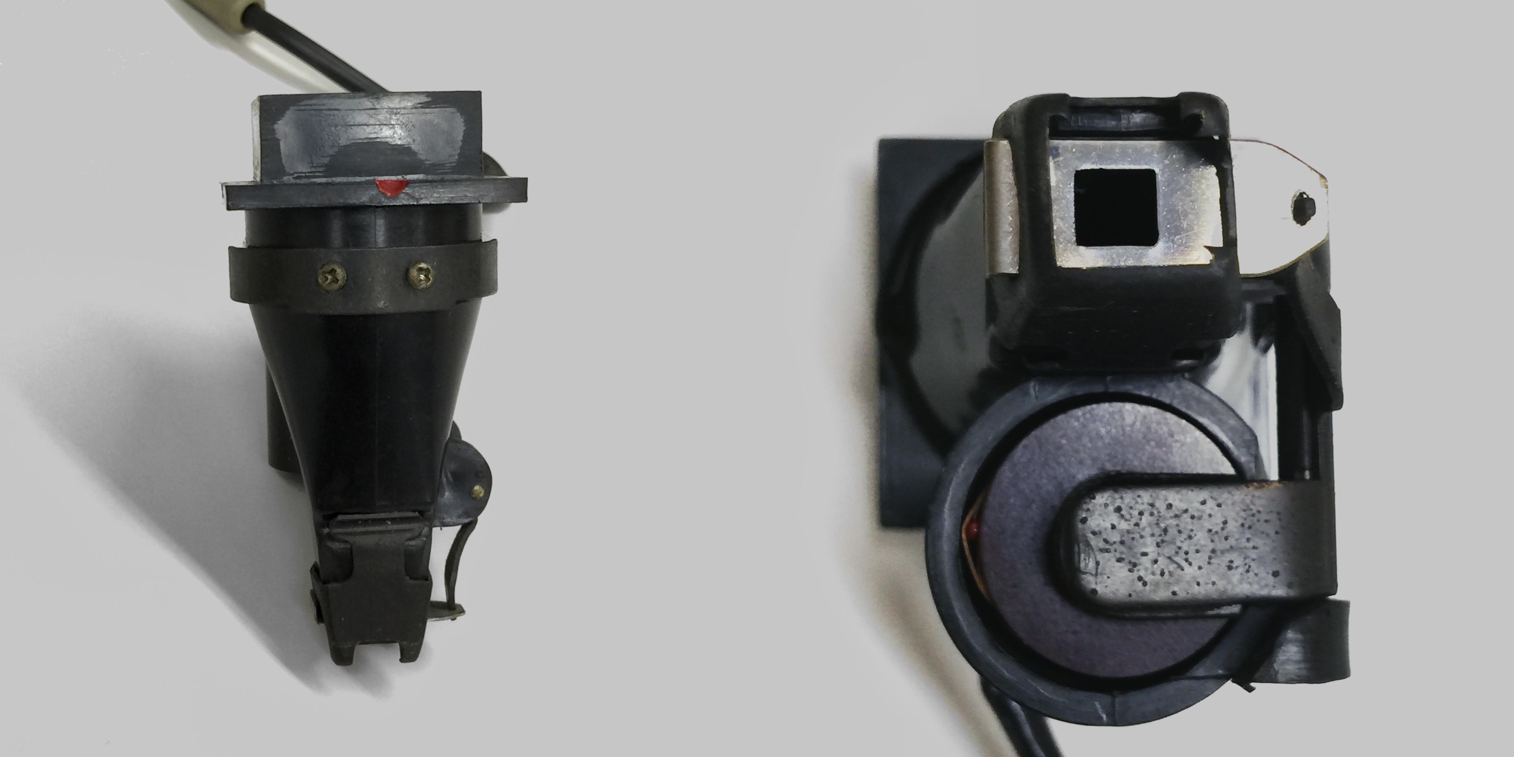
The images formed by the light beams proceeding through the font or mojiban included not only the image of the expected glyph, but also unnecessary images of other glyphs etc., and it was necessary to cut off any other light beams not coming from the negative glyph image. Therefore, early phototypesetters usually had a Light Shielding Mask after the glass-grid font, with a square hole that can eliminate any other light beams not coming out of the square range. (In special cases, for example, when typesetting ruby kana transliterating characters or italic characters, it was necessary to use a mechanism to shift the position of the Light Shielding Mask, so that ruby characters could be typeset beside a kanji (Chinese) character, or the entire glyph image of a kerned italic character such as ‘f’ could be included). See Figure 2.
This limitation due to the EM-square Light Shielding Mask was subdued greatly, when the Light Shielding Mask was replaced with a similar masking device, and it was located between the glass-grid font and the light source with a condenser lens to make light beams parallel. However, as early phototypesetting machines had the mask (after the grass-grid font, just before the lens system), Latin alphabet glyphs included in Japanese fonts produced by phototypesetting machine manufacturers or fonts designed to be used for Japanese typefaces, tended to be designed with shortened descenders that did not extend beyond the bottom side of the EM square type body.
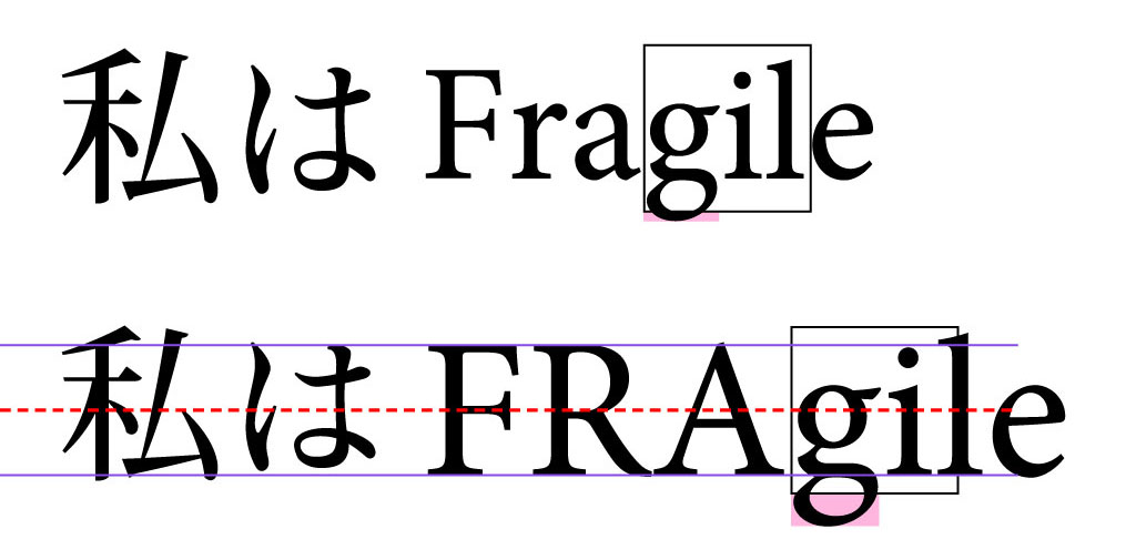
The upper example in Figure 3 is a typical example of Latin alphabet glyphs composed in a Japanese line. In this example, the descender of the lower-case g extends far below the EM-body boundary. In the age of phototypesetters in Japan, this descender extending below the EM square space could not be rendered, and it was necessary for the font manufacturer to make a design with a shortened descender beforehand.
Also, for many Latin alphabet typefaces originated in the age of hot metal type, the square EM type body was still one of the constraints to the glyph shapes to be designed, and the relative position of the Latin alphabet baseline tended to be set at a position approximately 20% higher than the bottom side of the EM type body. (For example, according to the Standard Line Faces proposed in the late 19th century by Inland Type Foundry in St. Louis defined the relative baseline position of a 10-pt type to be at 2 pt from the bottom of the 10 pt type body). Also when many proprietary digital typesetters were used through the 1970s, similar baseline positions relative to the EM type body was adopted on many systems (for example, at y = 96/432, etc). For the upper example in Figure 3 also, the base line position is set at 20% from the bottom of the EM body. (In the case of Japanese OpenType fonts, however, as long as the baseline position is not reset by the application software, the baseline position for Latin alphabet characters is set at 12% from the bottom of the EM body for Japanese). On the other hand, it is often required not to make the visual size of Latin Capital letters look smaller than that of kanji ideographic characters or hiragana or katakana syllabic characters. For this reason, we often need to enlarge the size of Latin alphabet glyphs by +10 to +20%.
Furthermore, if we adjust the baseline position for Latin alphabet characters, so that 1/2 of the Capital letter height aligns with the height of the center point of the EM type body, if the Cap. height reaches 80% of the EM body size, only 10% can be assigned to the descender. It is demonstrated by the lower example in Figure 3. The extent of the descender extending beyond the EM body boundary has to be increased largely, due to the scaling adjustment to make the Latin glyphs look as large as Japanese glyphs. If we were in the age of manual phototypesetters in Japan, no doubt, we would need to shorten the descender, but how could we do it? It would result in a horrible shape, wouldn't it?
In Figure 3., the black square is the EM type body. For each character, no shapes can extend beyond the EM body boundary, and anything beyond had to be cut off, in the age of manual phototypesetters in Japan.
When composing text with Latin alphabet and Japanese characters, there were constraints that could make the space for descender strokes too small in the age of manual phototypesetters in Japan, and Latin alphabet typefaces with glyphs with shortened descenders were designed intentionally for them to be used with Japanese typefaces. Also, we need to pay attention to the stroke widths, because if we scale the size of glyphs their stroke widths are also scaled. (In fact, the lower example in Figure 2 above shows that the Latin alphabet glyphs are now heavier than the other Japanese glyphs due to the scaling). In addition, it should be noted that there are extremely few Latin alphabet typefaces whose vertical stem widths visually match those of light weight Japanese Mincho (or Song) style typefaces designed for body text composition.
Today, in the era of digital fonts, the technical limitation that necessitated the cutting of descender strokes no longer exists. Even for Latin alphabet typefaces meant to be used with Japanese typefaces, it is becoming easier for us to create Latin alphabet glyphs without intentional, large distortion of shapes. Nonetheless, it is still always difficult to find a Latin alphabet typeface that looks good when combined with a Japanese typeface, and the situation where there are constraints in designing a Latin alphabet typeface that can be combined nicely with a Japanese typeface, is unchanged still today.
Taro Yamamoto
2015.6.26 v1.2 Mr. Tomio Oishi kindly sent me some photos of a LIght Receiving Guide with a LIght Sheilding Mask, and allowed me to use the photos for this page. I appreciate his kindness.
2015.6.18 v1.1 The description about the Light Shielding Mask was modified to reflect suggestions and information about the phototypesetter PAVO-KY by Mr. Tomio Oishi.2015.6.14 v1.0